

Graphic Design. Bachelors Portfolio
- Jan 22, 2022
- 4 min read
Updated: Mar 21, 2024
Bachelors degree completed with The Design School Southern Africa, now known as Vega. Subjects included: Graphic Design, Advanced Illustration, Business Practice, Advanced Photography, Art & Design Theory Research and Commercial Art.
E’lami | Wild Mary | Sugar & Spice | The story of the Couch Potato | Badilisha Poetry X-Change | Render Online Magazine | Cake | Dove | Splashy Fen Music Festival | Zenan

What Projects to Expect in this Portfolio
E’lami - Corporate Identity Design |
Wild Mary - Corporate Identity & Packaging Design |
Sugar & Spice - Corporate Identity & Promotional Design |
The Story of the Couch Potato - Editorial Design |
Badilisha Poetry X-Change - Editorial & Layout Design |
Render Online Magazine -Editorial Design |
Cake - Press Advert, Story Board, Packaging & Promotional Design |
Dove - Product Photography & Press Advert Design |
Splashy Fen Music Festival - Adverts, Promotional & Website design |
Zenan - Press Advert, Packaging & Promotional Design |
Every project in this portfolio represents commitment to producing high-quality graphic design. Each project is approached with a fresh perspective, taking into account the specific brief and target audience. From magazine advertisements to branding materials, the portfolio boasts a diverse range of graphic design projects and campaigns.

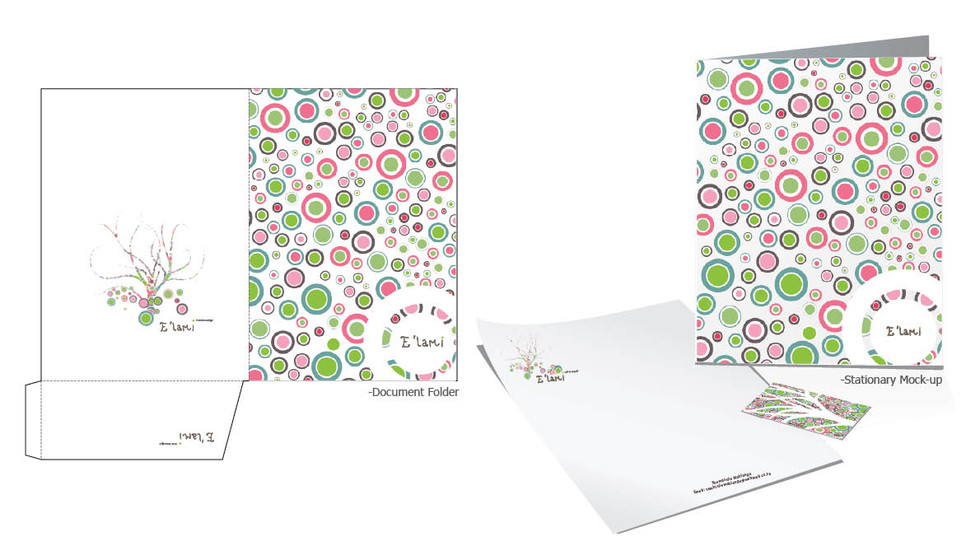
E'lami. Interior Design Studio
Logo. Business cards. Letterhead.
“ Corporate Identity design for a young upconming independent interior designer.”
E’lami, the word itself means ownership and it describes the interior designer’s entrepreneurial spirit. The tree element represents life whereas the rocks, illustrated as circles at the bottom of the tree, represents stability and support.


Wild Mary. Personal Brand Development
Logo. Business cards. Letterhead. Disc label. Foldable Disc Cover.
“ WildMary, a self-promotional brand identity.”
The WildMary concept centers around three wild animals: foxes, flamingos, and tigers, each embodying personality traits such as knowledge, confidence, and insight. These traits are also reflective of my own character. The brand's design features bold edges and striking contrasting colours, conveying the dynamic and energetic nature of the brand.


Sugar & Spice. Dance Studio
Logo. Business Cards. Letterhead. Corporate Folder.
“ The brand Sugar & Spice is built for an all-woman dance group that do opening acts for festivals and clubs”
A slick design that is fixated on flair, charm and enticing movement dancers portray in an act. The corporate identity is predominantly designed in green which represents hope, prosperity and immortality.


The story of The Couch Potato. Editorial
Editorial Design. Flyer.
“ The story of a couch potato is a visualization of procrastination.”
The story starts off with a clean room and a low BMI of 22.1. Over the next three frames, the story exchelates with litter pilling up and an increase of my BMI score as I procrastinate day by day. Finally, I stand up from the couch, face the world and achieve my goals.


Badilisha Poetry X-hange. Book Illustration
Layout. Print. Editorial.
“ Layout design for Badilisha Poetry X-Change. The organisation focuses on giving exposure to African historical and upcoming poets.”
The primary focus of the organization is to showcase new and old poets of Africa and bring them to the forefront of the world. The artwork created is for three distinct poems: Black Rock, Life's Battlefield, and Were I Become You. These poems share a common theme and are expressed through an earthy monochromatic colour palette to create a cohesive concept. Additionally, the book cover features an elephant made entirely of words, a symbolically knowledgeable animal in Africa. The word Badilisha, is also hidden within the pattern on the cover in morse code.


Render Magazine. Photography and Design
Magazine cover. Editorial layout.
“ Online Publishers, a conceptional magazine that features contemporary Fashion and Design.”
Discover a perfect balance between modern street fashion and rich history with this magazine cover design. Drawing inspiration from street fashion and the rich history of the ‘Voortrekkers’ era, the design is a perfect blend of past and present. The issue's centrepiece is the main article "Looking for the Lie," which takes readers on an emotional journey through the act of deception. With captivating visuals and a well-executed visual narrative, this design truly brings the concept to life.


Cake. Beverage
Logo. Business Cards. Letterhead
“ Cake, is an enticing prestige alcoholic beverage that is targeted at Women.”
The campaign is built around the sweeter things in life, cake, chocolate, candy and pastries. Focused on shock culture, the campaign name, Let them dring Cake, is, of course, a reference too, Marie Antoinette, the Queen of France during the French Revolution, who allegedly stated an illogical phrase; Let them eat cake, while her country was in dire need for food.
From the promotional advert to packaging design all have elements and reprehensible characteristics of living in the now and not worrying about anything that is too serious. The Cake alcoholic beverages included a square tin packaging design that stands out on a shelf, as obnoxious as the brand is portrayed.


Dove. Advertorial with Product Photography
Advertorial. Press Advert.
“ With a ¼ moisturising cream it is possible. Dove, reveal your true beauty.”
The campaign focuses on Dove’s compelling Social Mission, which involves enriching girls’ self-esteem and perspective about their looks. They help encourage all women and girls to develop a positive relationship with natural beauty, helping them to realise their full potential by revealing their true unique beauty to the world.


Splashy Fen. Music Festival
Concept Development. Website design. Pins. T-Shirts. Advertorials. Billboards.
“ Splashy Fen Music Festival, for a unique outdoor music experience.”
Established in 1990, Splashy Fen is South Africa’s longest-running music festival, which every Easter attracts thousands of people to a farm near Underberg in KwaZulu-Natal, for the best in South African artists and acts. (Group Project). The Theme, What is the meaning of Live?, is based on finding the meaning of life, whereas the answer is hidden within the editorial text already; Yourself. It is a festival where anyone can be expressive, celebrating their individuality while relaxing and listening to the best South Africa has to offer.
The campaign layout includes various aspects such as advertorial design, large scale billboards, festival tickets and creative problem solving creating a fan glow in the dark road map that gets printed on boots that can guide you to your camping area easily.


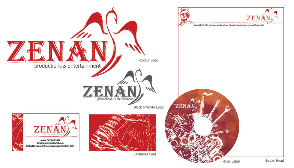
Zenan. Production and Entertainment
Logo. Business Cards. Letterhead. T-shirts. Advertorials.
“ Zenan is an upcoming local alternative artist known as Jean Oosthuizen.”
The name Zenan is constructed out of the Artists real name and an abstract phoenix the artist uses to represent himself. The Corporate Identity includes stationary, Disc covers, T-shirts and Promotional band stickers. Red is predominantly used with deep contrasting abstract illustration lines of the artist playing the piano and other instruments.


Comments